“Just Google it.” Today, the first stage in any purchase is a Google search.
And B2B buyers are no different. In fact, most won’t talk to a salesperson until they’re nearing the final stages of the buying journey:
- 94 percent of B2B buyers perform online research before making a purchasing decision.
- 45% of buyers are spending more time on research before making a purchase.
The only way to get into the early stages of the buying journey is to create lead generation landing pages that are targeted to your ideal customers and optimized for search.
And fortunately, it’s easier than you might think. Keep reading to learn:
- What is a lead generation landing page?
- How to create a lead generation landing page (with examples)
- Some landing page tips to help you optimize conversions
Let’s get started.
Related: The Year’s Best Lead Generation Tools (Ranked & Rated)
What Is a Lead Generation Landing Page?
To achieve this goal, a lead generation landing page offers useful information, available free when the visitor fills out a conversion form. What type of information works well at generating leads? Think:
- Webinars
- White papers
- Reports
- Ebooks
- Case studies
- Checklists
- Buying guides
- Yes, even a demo
Why is this important? To boost your close rates, you need a full pipeline. The easiest way to keep the pipeline full is to automate lead generation, so sales reps can focus on qualifying leads and selling. An effective landing page is a powerful tool for generating qualified leads for your sales pipeline.
How to Build a Lead Generation Landing Page
The best lead generation landing pages use elements like eye-catching headlines, compelling copy, and CTAs to persuade prospects to convert on the offer.
RELATED: Custom Landing Pages: The Unlikely Answer to Low Email Lead Conversion
So what’s the key to creating an effective lead generation page? Here’s the 10-step process for building a high-conversion landing page.
1. Headline
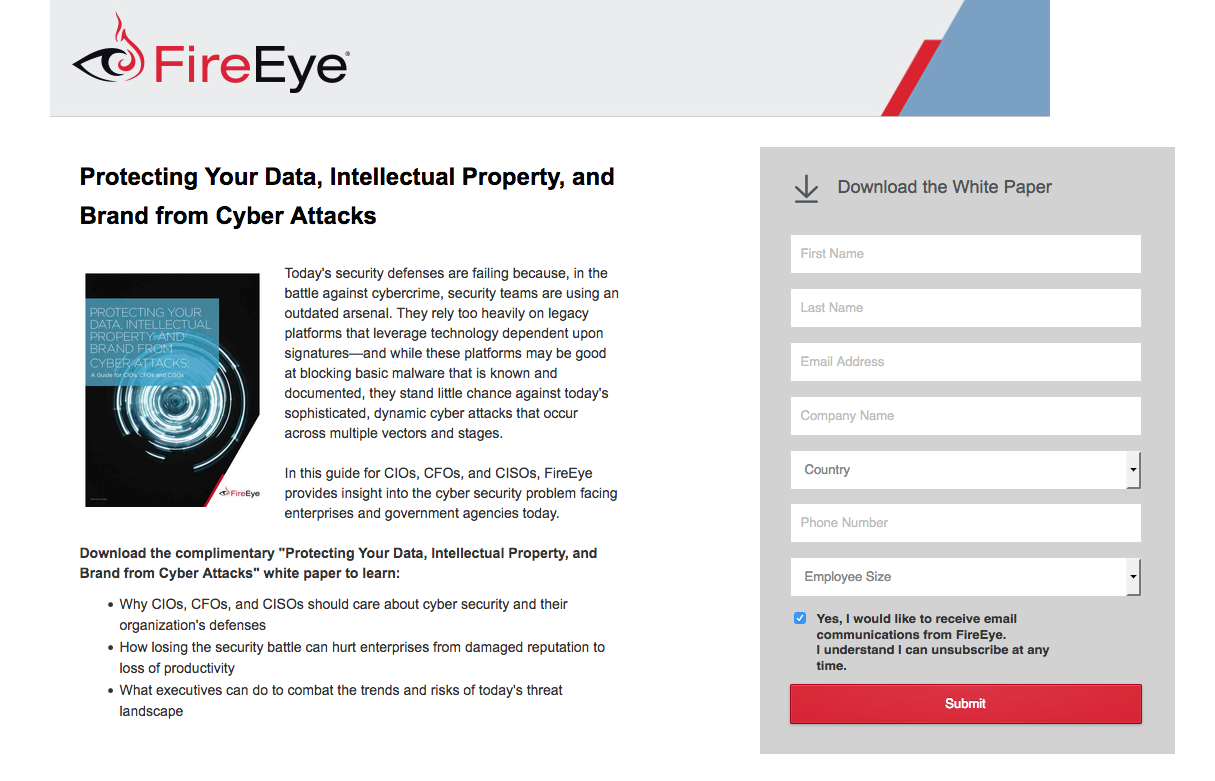
Lead gen pages must have a headline that conveys the benefits of the offer. Two headline formats that are particularly good at this are action headlines and number headlines.
Action headlines push visitors to take a specific action. In other words, the headline includes an action word, telling people what they’ll achieve if they download your information.
Number headlines put a numerical value on the offer or feature a statistic to catch people’s attention. The majority of visitors will read the headline but only skim through the copy.
Here’s an example of a strong headline from a FireEye landing page:
2. Header without navigation
Have you ever walked into a store and been so overwhelmed with options that you didn’t end up buying anything?
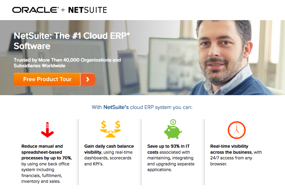
Websites require a navigation menu because they want to keep you on the site, exploring your pages. For lead generation pages, menu options give visitors an easy chance to leave the page without converting.
So remove the navigation from your landing pages. Remove the sidebar too. On a landing page, there should be just one action a visitor can make, and that’s to convert.
Here is a good example from Netsuite:
3. Relevant images
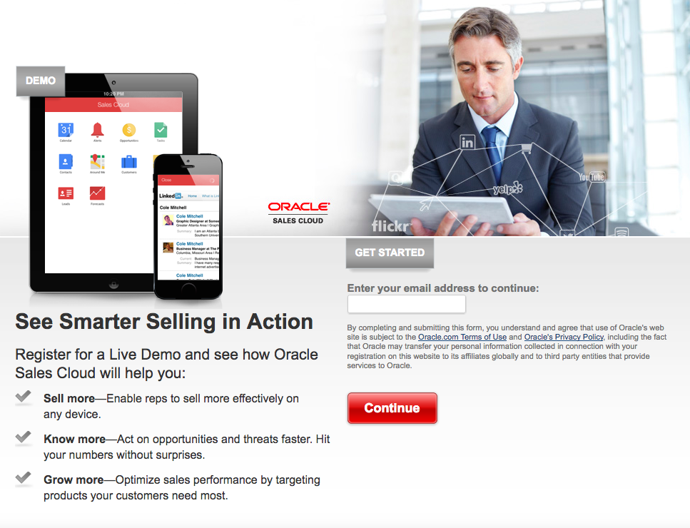
65% of people retain information paired with relevant images — compared with just 10% of people who only hear the information. With that in mind, it’s best to provide an image that highlights someone using your product or service, or shows what the visitor will receive if they convert on the page.
In this Oracle example, the image compliments the rest of the landing page because the man is presumably using Oracle’s sales cloud software.
Also, notice that his eye gaze is looking down toward the “Get Started” call-to-action button and the email capture field. This is known as a visual cue and subtly implies that visitors should enter their email and register for a live demo:
4. Copy
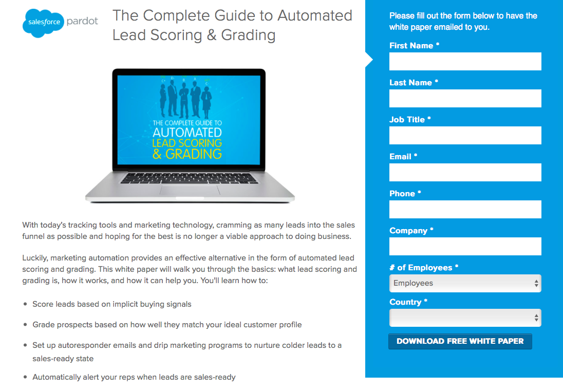
Most visitors are looking for copy they can skim, not read in full, so large paragraphs of text should be avoided at all costs. Keep your landing page copy short and use bullet points whenever appropriate.
Not only will bullet points keep your copy to a minimum, they also draw attention as visitors are skimming your page and evaluating your offer.
Take Pardot’s landing page for example, and how they make good use of bullet points:
5. Form
That high school science project that you designed poorly didn’t get you an “A.” So why would a poorly designed lead capture form capture qualified prospects?
Prospects don’t want to spend a lot of time inputting personal information before they can claim the offer. One case study proved that removing a single form field can boost conversions 26%. The less information you require, the more likely you will get a conversion.
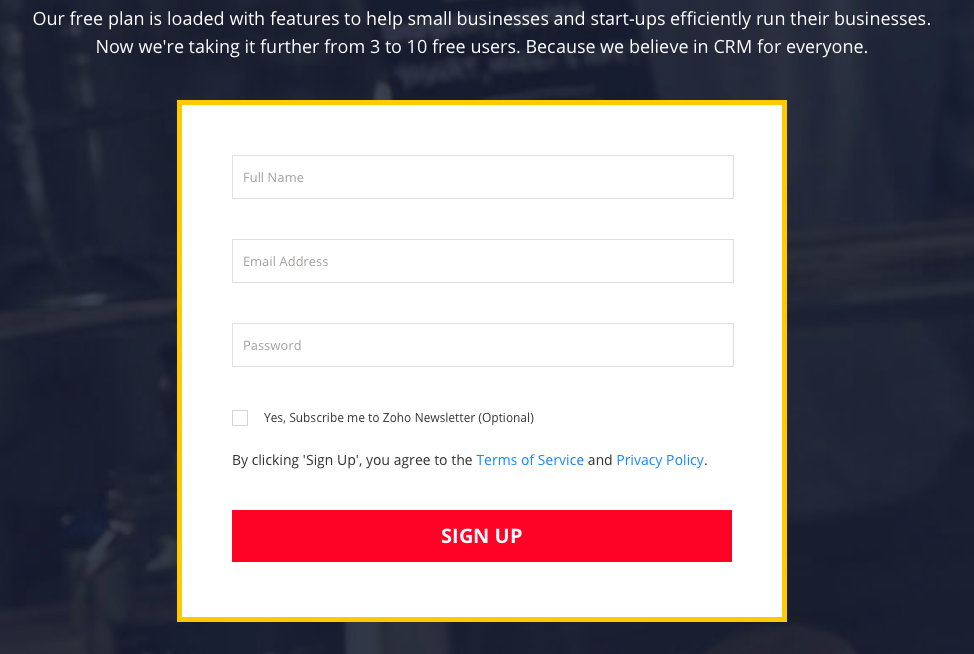
Here’s an example of a short form from Zoho — only requiring three fields — increasing the likelihood of conversion. What’s more, their CTA button contrasts with the white form and dark blue background, which draws visitors’ attention:
6. CTA
The call-to-action button (CTA) is the most important element on a lead generation landing page because it’s how you generate a new lead.
Without the button, you’re wasting your time. Consolidated Label experienced that when they performed an A/B test with the original version omitting the CTA button.
Once they created a new landing page variation, they produced 62 percent more conversions than the original variation.
Visitors need to feel compelled to click on the CTA button. Convince them. After all, it’s the simple push of a button that stands between you and that lead added to your funnel.
Avoid bland copy such as “Submit” or “Finish” in favor of personalized copy like “Send Me the Ebook.” Make it clear what prospects will receive.
The CTA color should contrast with the surrounding elements as well to draw maximum attention (see Zoho example above).
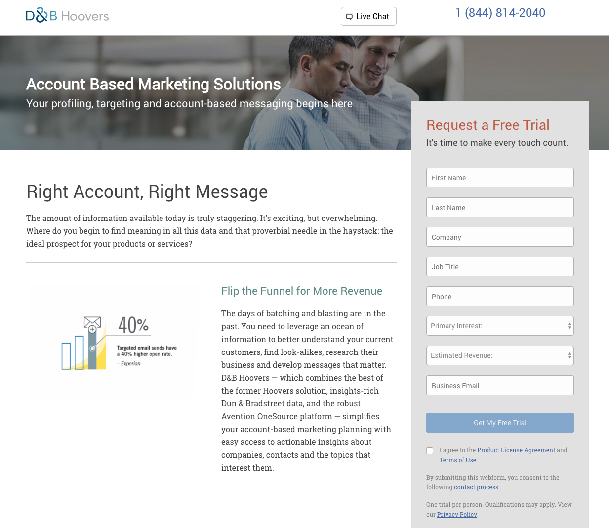
The D&B Hoovers landing page below uses “Get My Free Trial,” which personalizes the offer for the prospect:
7. Trust Badges
Trust badges are symbols or icons that highlight the credibility and legitimacy of the company’s brand. Many types of trust badges can be used to validate their product like industry awards, security seals, and customer logos.
For example, a survey from Econsultancy/Toluna showed trust badges significantly increase the perceived trustworthiness of a brand, and brands that prospects trust are more likely to get conversions.
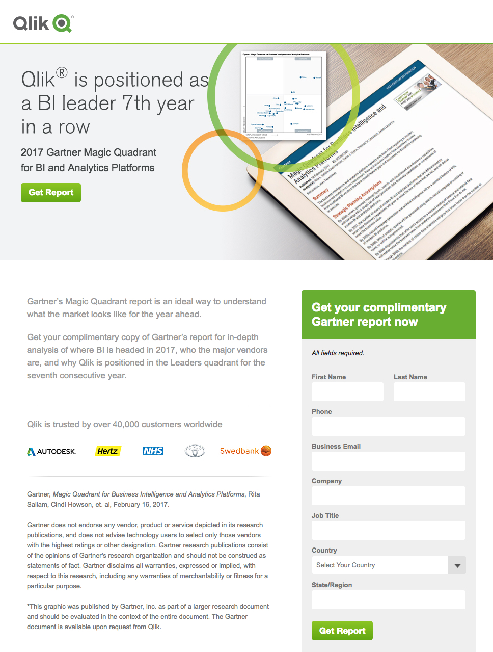
On the landing page below, Qlik uses customer logos to showcase the major brands they work with, which makes them appear more credible:
8. Social Proof
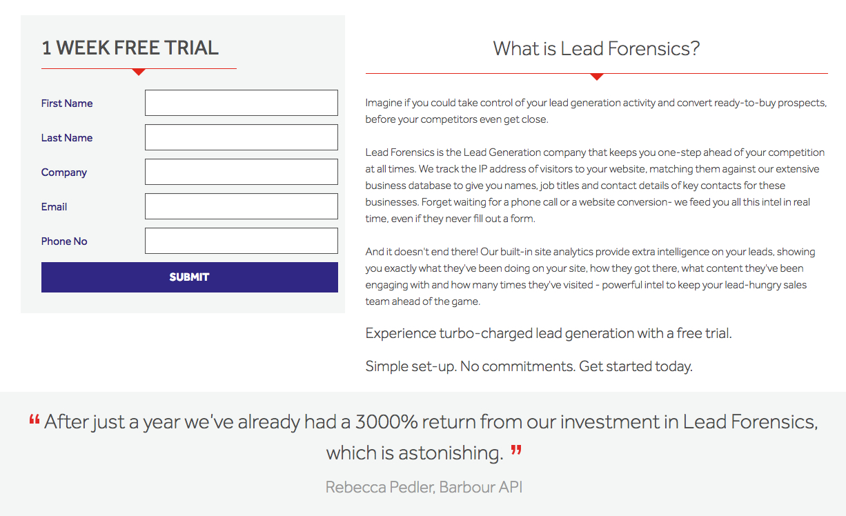
Customer reviews, testimonials, and case studies are social proof to potential leads that others have had a positive experience with your company. What better way to show prospects you stand behind your product than to have current customers speak on your behalf?
Lead Forensics demonstrates this well with their customer testimonial:
9. Privacy Policy
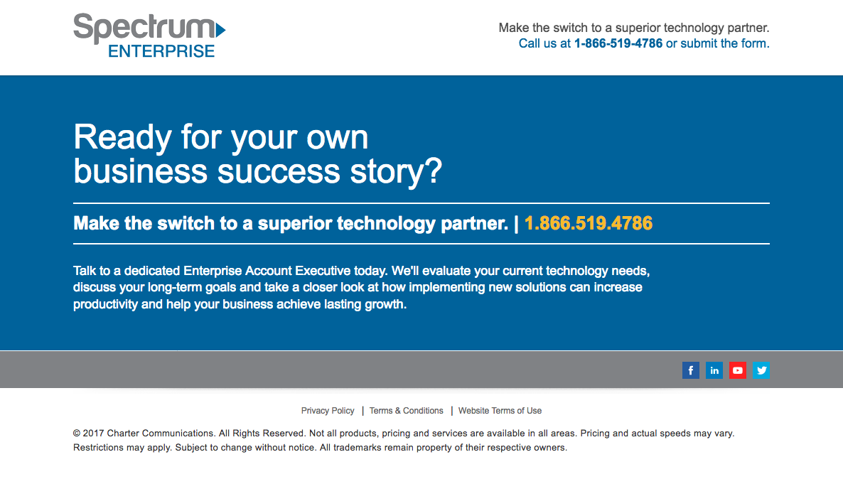
People want reassurance that their personal data won’t be misused after they complete a form — and regulations require it. Make sure you comply with GDPR and CCPA by including a privacy policy on the page.
The Spectrum landing page below incorporates a privacy policy link in the footer, which opens a new tab — taking visitors away from the offer. The only recommendation would be to have the link open in a pop-up instead of a new tab.
10. Thank You Page
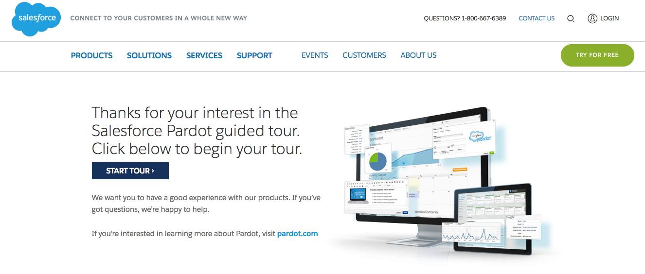
Thank you pages are an underrated component of lead generation campaigns. These pages should appear after a visitor claims the offer and let visitors know where they can receive the offer.
In the Salesforce example below, the “Start Tour” button lets visitors take the next step immediately. Another best practice for thank you pages is to direct visitors to check out additional company resources.
Putting It All Together
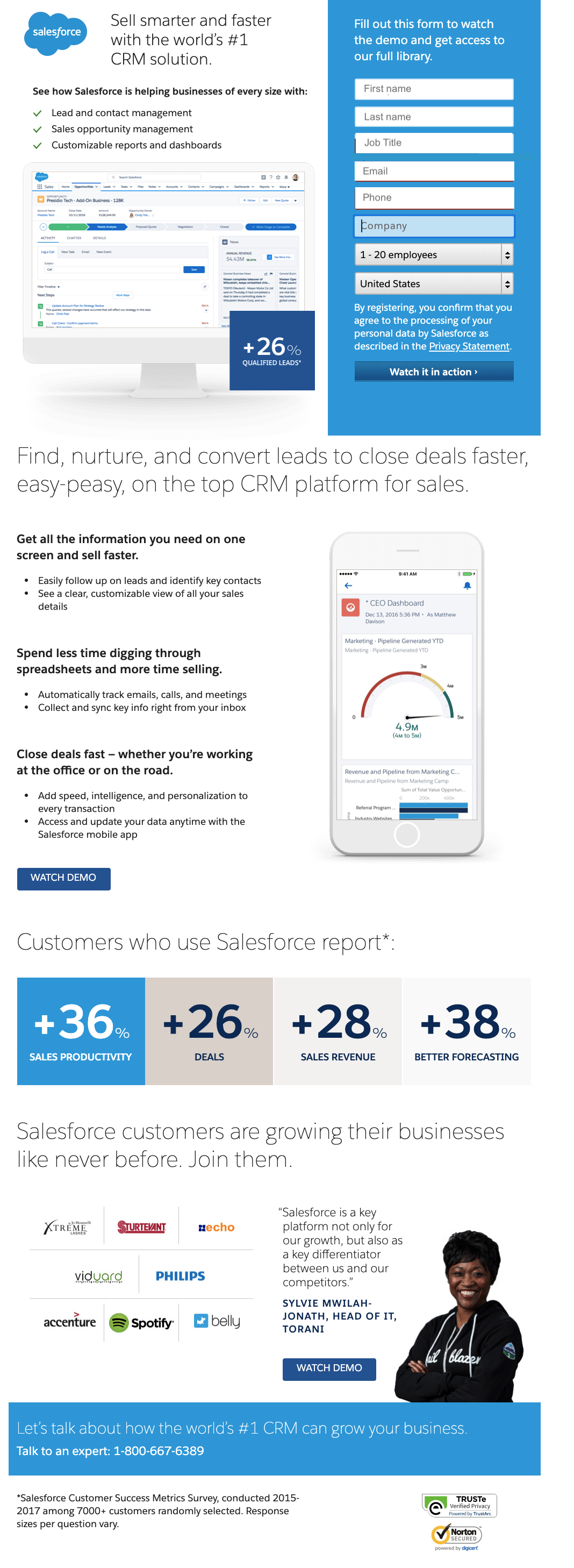
This landing page by Salesforce is a good example of how to include all these best practices on one page.
What it does right
- The benefits-oriented headline tells people exactly what Salesforce can do for them.
- There are no distractions: no navigation, no links, no sidebar.
- The layout is clean and clear, with plenty of white space. Images don’t just illustrate. They add insight, supporting and expanding on the copy.
- The copy is short and to-the-point. Notice the bullets, which make this page easy to scan. Notice also that they put the most important information above the fold. If you’re interested, you can fill out the form right away. But if you want more information, you can scroll down for more compelling reasons to register.
- The form is on the long side, but if you’ve downloaded anything from them before, the fields are auto-populated, so all you have to do is click the button.
- There’s just one CTA: Watch the demo. That said, if you want to talk to a person, you can. A secondary CTA takes you directly to a sales rep.
- Trust signals are done very well. Above the final button is a client logo cluster. Below it are two reputable trust emblems.
- The privacy policy is clear and easy to see (without being obtrusive). Notice the disclosure statement just above the button in the form. Salesforce tells users that by registering, they’re subscribing. And if there’s any doubt, they include a link to their privacy statement.
7 Tips for High-Powered Landing Pages
Dedicated landing pages are the perfect way to make a lasting first impression with potential customers. They’re designed with a single objective, whether that’s to promote a new eBook, white paper, register people for a webinar, offer a free demo, etc.
To get the most from your landing pages (and drive a significant number of leads), follow these lead generation landing page tips:
1. Be 100% relevant.
Your offer needs to be something your audience is actively looking for: information, a solution, a process. Your landing page isn’t there to convince people they have a need. It’s there for people who know they have a need — and it gives them exactly what they’re looking for.
2. One purpose, one call to action.
Be ruthless about paring down the content on your landing page. To ensure visitors don’t get distracted and take an action you didn’t intend, remove navigation, links, and other engagement elements. To ensure they don’t get bored and click away, keep the copy short and compelling. The bottom line, if it doesn’t help drive conversions, remove it.
3. Design matters.
People assess your brand and your product within the first few seconds of arriving on the page. You need to get the design right, so you’ll inspire trust. Design can also impact your ability to rank in organic search, so take as much time optimizing your page layout and design as you do on the copy.
4. Be hyper-focused on benefits.
Most prospects read the headline and skim the copy, so a benefit-oriented headline and minimal copy is critical to your landing page’s success. And remember, benefits sell, not features. Be sure to translate every feature into an outcome that your lead is looking for.
5. Reduce friction.
Create forms with as little friction as possible and design a color contrasting CTA button.
6. Personalize it.
Make sure the copy is personalized to your target audience. It should speak directly to their questions and what they’re trying to achieve right now.
7. Provide social proof.
Social proof like testimonials and case studies provide credibility, so highlight positive experiences and results strategically to increase conversions.
True Success
Landing pages can keep your pipeline full — you can count on that. But you need to understand: Most landing pages don’t perform their best the moment they’re published.
You need to monitor the landing page’s performance and tweak different elements to continually improve results.
Use a heatmap to see how people engage with your page. And use A/B testing to incrementally improve its performance. As you do, little by little, your page will become a lead generating machine!
Has your business defined the persuasive elements you want to use on landing pages? How will you use these elements to drive leads? Let us know what you decide in the comments!


